DK Web Redesign

Overview
In 2021, the DK community is looking to business expand, and detail the service they have. In the beginning, DK only had two businesses: offer internships and job referral service. Through communication, we learned that stakeholders want to add resume revision, interview training, and IT courses in the current business.
Problem
Visual Design: Color theme is not match with DK Community's logo theme. The black background looks too heavy.
Readable: There are more than 4 fonts on the website. Users need to spend more time reading.
Funtional: Some hyperlinks have expired, video could not be loaded. User comment function is slightly redundant
Role
UI/UX Designer
Guided the aesthetic direction of the project documentation and the presentation deck
Set design goals for the project
Research, personas, user flow, sitemap, wireframes, style guide, prototype, user testing interview
Duration
2 months
Tools
Figma, Xmind, Wix


Empathy
Competitive analysis
User interview
Research
Competitive Analysis
How might we highlight the advantages of DK community, after comparing with competitors?
Competitors
There are a large number of referral job agencies on the Internet, they provide referrals from Fortune 500 companies, as well as resume optimization, and interview coaching.
The Gap
While there are many agent on this topic that could make the DK community hard to stand out, but DK community's committed to serving Chinese students and new immigrants.
Opportunity
DK community has regional and network advantages in Canada and USA. By getting to know experts with deep experience in North America, DK community can develop in the direction of IT Boot Camp.
Research Methods
12 QUESTIONS | 5 PARTCIPANTS | AGE 20+
Participants Qualification
All participants were people who might need DK's service, they are college students and college student's parents
Some participants are bilingual, some can only speak Chinese or English
Participants were located in Canada, USA, and China
User Interview
We give all participants DK community's original website and ask for their feedback to gain more detailed insights into how they viewed the original DK community's website but also their grievances
If we had more time, we would have looked into competitor website to see what they did as well
Result
From the research, we pick out 4 major topics that would influence what our project would focus on and function as our criteria for success


Define
User personas
User flow
User journey
Problem statement
Persona
DK Community's three targets and mainstream customers
Jason Lee
International students who have just graduated and looking for a job
JiangLin Wang
Parents of international students who want to urge her children to find an internship
Angela Sun
New immigrant who intent to shift in IT industries but with 0 experience
 |  |  |
|---|
User Flow & User Journey
In addition to a user flow,
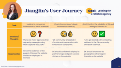
user journeys showed the flow from user goals gets translated into actions to complete them
Jason Lee
GOAL
Looking for career advice
JiangLin Wang
GOAL
Looking for a reliable agency
Angela Sun
GOAL
Looking for career in IT field
 |  |  |  |
|---|


Ideate
Site map
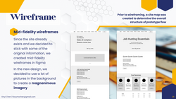
Low-fidelity wireframe
Style guide
Testing
Site Map & Wireframe
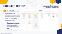
Prior to wireframing, a site map was created to determine the overall structure of prototype flow
 |  |  |
|---|
Style Guide
Establishing a style guide with the goal of creating a clean, bright, and magnanimous design
 |  |  |  |  |
|---|

Prototype
High fidelity prototyping
Platform & Benefit

Platform
Prototyping without professional software like Figma or Adobe XD is a bold decision.
Since the original website was built on Wix, Wix is also relatively simple to use. It does not require any coding skills, and this project needs to do not many interfaces. We built the prototype directly on Wix without affecting the original content.
Benefit
Since the prototype is consistent with the final web page authoring tool, the prototype and the final web page will not be too different, especially in terms of user interface and interaction.
The current prototype is not complete, but the interaction is enough for us to complete user testing.


Test
User testing interview
Iterations
Reflection
User Testing
User feedback is the key to making any business successful
When we have visuals we can get a better reaction out of users. We publish the prototype page and hide it from the menu bar. Started our secret user testing.
We went back to 4 of 5 participants in the previous reseach, plus 3 UX expert reviwers to do the user testing and see where they like or not like about the new design.
Qualitative Data
Positive Review
"There is more clarity in the menu bar now. A clear structure can be seen."
"Nice pick of image and video. Looks clean and professional."
"Using a large image background makes the page more appealing. I would love to spend more time browsing this page. This grabs my attention more than the old one."
Concerns
Visual Design
"Due to the large number of images used, some buttons need more highlight color."
"It is difficult to see buttons with background videos. It is unnecessary to have too much animation."
Customer Service
“LiveChat cannot provide 24/7 support due to data and management issues in the back-end.”
Iterations
Add highlight color
In order to match different background images, we decided to use different colors on certain buttons to highlight.
We don't limit the number of highlight colors. Our goal is to find the right colors for the web.
QR code for more convenient contact
In terms of common sense, users in China use WeChat as a communication software
According to the data, customers who contact DK, whether by email or phone, will eventually be linked with stakeholders on WeChat.
Therefore, we designed to put the WeChat QR code image in the lower right corner of the footer.

Reflection
Connection
Documentation
Reflection
Connection between different industries
The people on the team have different backgrounds. We come up with ideas that drive the design from different observations and integrate them into the final design. We learned a lot from each other.
Work smarter,
not harder
Using Wix as a prototyping tool is a brilliant idea. Since the original site was created by the stakeholder herself, she has some experience with Wix. We can easily explain to her the structure of the web page.
Documentation for different aspects
During the design process, we spent a lot of time interacting with users, as well as user surveys, and the persona part. We use a lot of tools to organize our research and make inforgraphics, and finally sort out all the information clearly.


